Checkout redesign
Argos
Redesign of the checkout experience with the goal of updating the overall design, making it fully responsive while tackling poor converting steps along the way. Initial results found a 0.8% increase in collections and this experience has been white labelled and rolled out to other checkouts within Sainsburys portfolio.
Platform: Web
Role: Experience Designer
Date: 2019
Understanding the problem
As always, the place to start with this project, was to analyse the current experience.
Checkout journey(s)
Below shows the journeys that a user could potentially go through depending on if they wanted collection or delivery & pay now or later. I was brought with aiding in a replatform of the collection, pre-pay journey (highlighted) and improving the overall experience & conversion.

Current issues
Below outlines some of the key issues with the current design of the Argos checkout.
-
MWeb & Desktop - The current checkout was not responsive, instead supporting simply 2 viewports and breaking between those. These viewports were also created as 2 separate code bases.
-
Outdated design - The whole of the legacy checkout design was inconsistent with the rest of the Argos site.

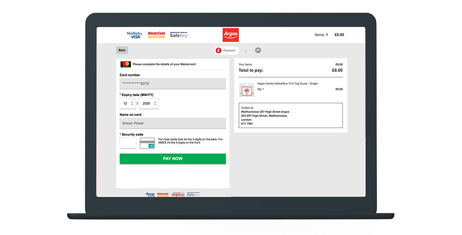
iframe for payments - Due to Argos not wanting to take PCI burden, payments are taken by a 3rd party payment form via an iframe. The button in this form (has to remain in the form) will activate the payment yet the current implementation seemed problematic at best.
Conversion & drop offs
The legacy Argos pre-pay collection journey had a number of steps within it, including 2 separate payment pages, which seemed to be a significant drop off point.

Ideation & research
Below outlines the research that was undertaken throughout this project. Working closely with our UX researcher, we were able to put together a timeline of research where guerilla and remote testing bridged the gap between in person laboratory testing, making sure we were constantly & iteratively designing based on user feedback.
Low fidelity designs
I began this project by creating a multitude of very low fidelity designs. These were initially narrowed down by team feedback of flat designs and interactive prototypes. This feedback allowed me to further narrow down the options and in workshops get my PM, stakeholders and other designers to then further critique and explore options from those prototypes.

Guerilla testing
With physical stores, I was lucky enough to go and test very quick concepts with real users. This coupled with colleague testing at our large head office allowed me to test an idea and rapidly iterate on it if it failed and there and then re-test.
A great example of this was various iterations of designing an order summary section on the checkout. I created iteration after iteration trying out different patterns to make an expandable section clear to the user.

After all attempts it failed, but that’s ok as with this rapid guerilla testing format I was able to discount this with the extent of the work undertaken.
Remote testing
As the base of the page began to be cemented, my UXR and I focused on some of the further, complex journeys. Doing unmoderated testing in itself was a good test of the design for simple tasks (e.g. adding a promo).

During this process I began testing desktop designs, also looking at a large single column (below) vs right hand rail.

Lab testing
Lab testing was undertaken throughout the design process and gave us fantastic insights. Even at the earliest stage of designs, we could see how Argos users faired. This was vital as it helped me understand very early on how the page should be structured and crucially why. Users always need to have a guiding light of that primary CTA, we found this out very quickly, so I made sure every step a user had to do, simply had that helpful guide.
Empirical evidence & analytics
It’s vitally important to also follow conventions and tested patterns by usability experts (not just someone on Medium...) as well as taking into account quantative data how your users actually use the site. As such, everything on each page is there based on analytical data, internal or external usability research or technical restriction. Nothing is unconsidered.

Pay now/pay later
The decision was made to design, build, launch and test this particular page in isolation from the other pages in the Pre-pay collection re-platform. Each version below was launched as an A/B test against the legacy design and left to run to reach statistical significance.
Version 1-4

-
Designed before I arrived, this had the options stacked with a primary and secondary CTA. This was significantly down on legacy.
-
Reverting back to the radio layout to have a single CTA and also a reduction in copy. However this was still significantly down on legacy.
-
Again reverting to the top/bottom layout and further tweaking of reduction in copy. Still significantly down on legacy.
-
Updated to new design pattern, further copy pruning & introduction of price total. Still down but improvement over previous versions.
Version 5

This option utilised a different design pattern of stacked blue, large buttons, with the colour not directing any form of hierarchy and also allowed the user to scan both options quickly and easily. The price total was also included in the header so the user is never in doubt that the price hasn't changed.
Across the board this was significantly up not only on all previous verisons but also on legacy too: +0.8% on collected conversion equating to an incremental revenue increase of +£17million.
Solving the problem
Below shows the final designs that were built by the Argos checkout team.

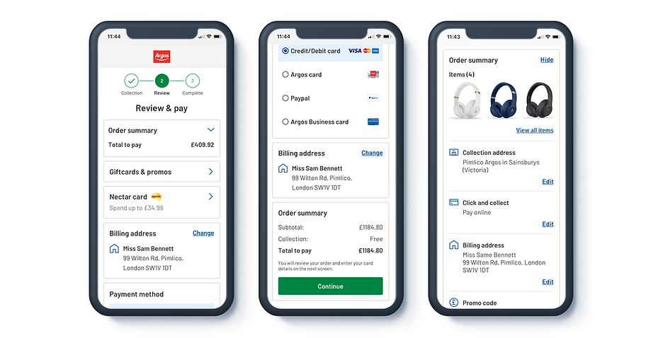
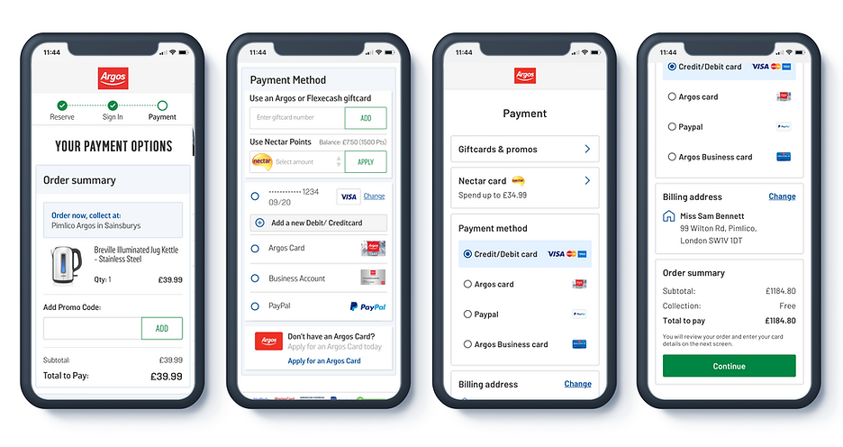
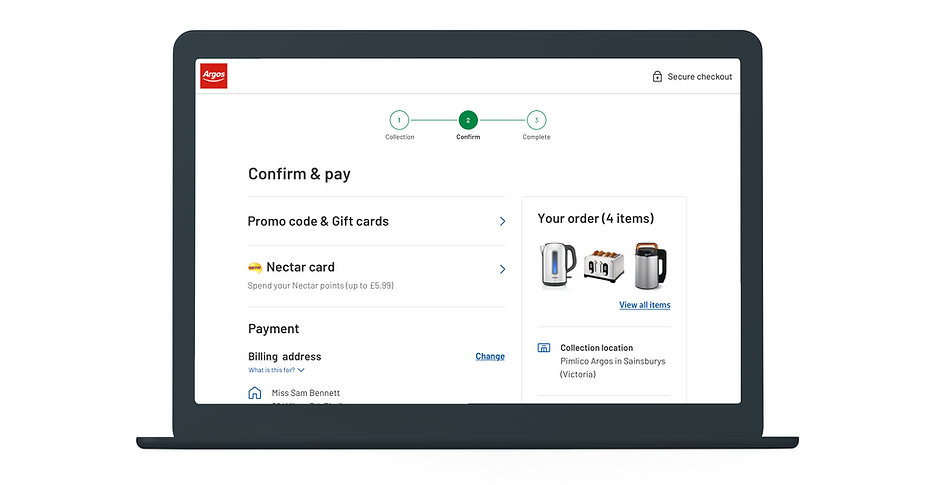
Confirm and pay page
As the title suggests, the page is to simply review that all the necessary things (items, collection location, etc) are correct and to pay (potentially promos & nectar). The design is based around this simplicity and streamlining complex mechanisms (address & payment form fields).

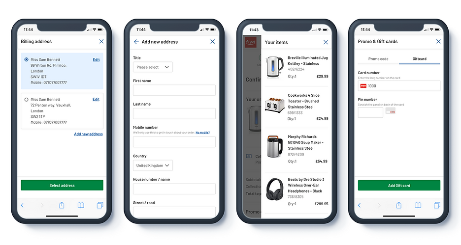
Add/edit journeys
All actionable features are on modals only being brought in when required by user, helping to keep the core page clean and easily able to digest.
Desktop
At 992px upwards, the top order summary kicks out and becomes a right hand rail. This gives the left hand side the attention to the user of what must be done, while the right hand rail is supportive information.


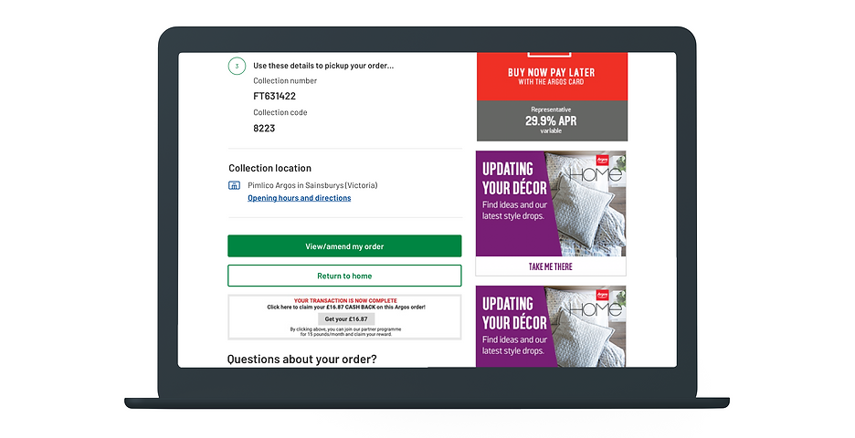
Order confirmation page
Again a similar layout where below 992px, we have a single column design, and above 992px we have a right hand rail.
One key area is the collection details section, Argos store workers stating that the biggest issue users have is not knowing when their items were ready. We paid extra attention to detail in regard to making sure this info was clear and scanable as possible, and that even at a 320px phone size, taking a screen grab would get all of this information in one go.


Outcome
Delivered on time
Delivered designs on time to the tech team to meet all delivery milestones.
Conversion uplift
+0.8% on collected conversion equating to an incremental revenue increase of +£17million
No changes since launch
Since 2020, there has been almost no change to this checkout, implying that if it's working, there is no need to change it.
Checkout has been white labelled
This checkout that I have designed, has been white labelled, effectively replicated and used by other checkouts for other brands in the Sainsburys portfolio, the only differences being the change of colour branding and top nav logo.