Customer care redesign
ASOS | asos.com
This project was intended to redesign the customer care section for the ASOS customer but fundamentally needed to reduce contacts into Customer Care while still giving all the answers to customers problems & increasing NPS and CSAT measures.
Platform: Web
Role: UX Designer
Date: 2018
-
Understanding the problem
At the time of the project commencing, there were a number things which would influence how we approached this.
Costs of a call
At the time of picking up this project, 1 in 3 orders resulted in a contact being made to Customer Care (around 1.7m per month), costing roughly £3 per contact. Understandably, there was a desire to reduce this.
Current implementation
The current Customer Care section used an old implementation of the ASOS design system, old icons that tend to be pixelated, a single page layout and inconsistent use of global nav and banners.

Competitor review
The first place to start was a review of not just ASOS competitors, but e-commerce in general & other digital industries to uncover key help based features.
Highlights:
Readability and scan-ability of FAQs.
Next action from an FAQ.
FAQs more than just text.
Visibility & find-ability of contact options.
Undercover key info from more than just one place. Re-use FAQ info during contact journey.
Chat bot integration.


User interviews
User interviews were set up, with the aim being to discuss previous experience of help based interactions for online/offline products. A second part to this was to give the user scenarios (top ASOS contact queries) and see how they would find this info on a competitors site & ASOS.
Highlights
“I just want to contact” standard response when faced with an issue.
An eagerness to always double check before contacting.
Those with an experience of ASOS help has always been positive.
Amazon, Nike and surprisingly Zara users rated as good help based experiences.
Boohoo and River Island received alot of criticism.
-
Research - current designs
Testing was undertaken over a number of remote and in person sessions (across mobile, tablet and desktop) on the current designs to highlight as many usability issues as possible. Surveys were also undertaken to get quant feedback on features such as naming, icons, design, preference of tweaked layouts and desirability of new features.
Sessions:
x3 User Testing Session 18 users (6 desktop)
RECCE Session 6 users (tablet)
x3 Survey 805 users
Observations and quotes
A number of users did like simplicity of page, and especially colour blocking on desktop.
Frustrations centred around length of page.
“It looks like a webpage from the 90’s”.
Users had confusion around summary text and whether it was clickable.
Users had difficulty in understanding content and identifying next step actions.
Low desirability and importance found for article date and ratings.
“It’s really wordy... better if just headings”.
“This page is a little unfinished looking”.
Ratings
Likert scale measurements were taken in an attempt to baseline the ease and clarity of navigating to FAQs on the current Customer Care website.

-
Research - proposed designs
Multiple iterations of designs were undertaken, with rounds of qualitative and quantitive feedback driving us through. We were testing cards that hide and closed, naming of sections and clarity of icons, preferences over landmark imagery, taxonomy and hierarchy of information.
Sessions:
x6 User Testing Session - 35 users
x3 surveys - 700+ users
Proposed designs
Low to high fidelity designs were used across the 6 user testing sessions.


Results
Running the same tests on proposed designs, found an increase in ease and clarity of navigating across the board, and in every case of comparison clearly won out. Across all of this testing, the proposed design, users pointed out the simplicity of the layout, the usefulness of section headers and ease of finding articles.

-
Research - FAQ template
After doing rounds of testing, it became apparent that getting users to self serve looked to certainly improve with proposed designs however the content with the FAQs themselves would need to be re-written and formatted in a much easier digested manner.
Session:
Survey of 405 users - US & UK respondents
Tasks
Take top 10 most read FAQs
Get users to self rate their understanding of FAQ (50/50)
Quiz users to see actual rates of understanding (50/50) Rate clarity of content (50/50)
Rate ease of readability of content (50/50) What is preferred layout? (100)

Results


-
Research - inclusion in my account
Remote testing session where one task was to have users understand why their order was unsuccessful and what they would do next. Comparing current vs proposed My Account orders page found that even when a contact option was on offer, users, given sufficient info, would not need to contact.
Sessions:
12 user testing sessions - 6 current / 6 proposed
Proposed

Results

-
Solving the problem
With all of the research and effort put into this, I am incredibly pleased with the final output.
Simple, clean design
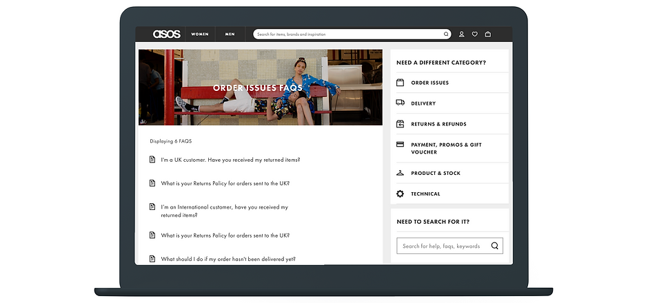
These pages were built with the idea of simplicity at the heart of it, icons used for pinpointing specific info, images as landmark headers to make sure users knew where they were and a re-used card based design which simply changed on page.
Having just a small number of re-used solid, tested components meant this design was easier to design, develop and modify then the previous non-responsive layout.

FAQ templating
The core of the Customer Care pages is the hundreds of FAQs that make up this site and hold the key information about what to do. The current implementation is not easy to scan and digest so it's imperative to design guidelines about how to these were to be written, the structure of them and what should be included. Testing has shown an increase in perceived understanding with the new designs, so this new logic must be baked into all the content design.

Responsive and cross platform
These pages have been designed with mobile first approach, but the customer care section is now responsive across multiple viewports. The projects first stage was web only, however was designed in a way where porting to native Android and iOS apps would be achived with minimal fuss.


Outcome
This redesign was delivered after I left ASOS in 2019 and is still being used today without any significant changes to the original design proposals.