My account redesign
ASOS
Launched a redesigned My Account section across responsive web, iOS and Android simultaneously with the key goal being to reduce contacts into the help centre. Post release analysis found a 2% reduction in help centre contacts from the order details section, the single highest driver of calls from the My Account section.
Platform: Web, iOS, Android
Role: UX Designer
Date: 2016
Understanding the problem
At the time of the project commencing, there were a few things which would influence how we approached this.
Business goal
-
Reduce Customer Care contacts (specifically orders)
-
Re-platform and not rely on 3rd party contract to support current implementation.
-
Create a solid My Account base as the first step and an enabler in a long line of projects focused on the post purchase experience.
Current implementation
The current experience was a single page, unresponsive website that was crowbarred into native app experiences. It used old design patterns and looked very alien to the rest of the ASOS site.


Ideation & Research
The next step was to begin defining our approach to consenting and this included analysing user journeys and sketching through wireframes for potential ideas.
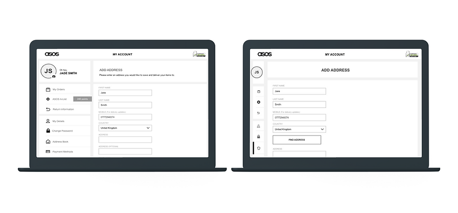
Information Architecture
The obvious place to start was the underlying architecture of this new My Account system. The first question we asked ourselves was, did each of the categories contain information that made sense to the user? If we were to split out a single page app into multiple sections, did users understand the names of each section and finally, what icons to use for them?

We undertook open and closed card sorting tests to figure what the content categorisations could be, and looked to treetests to see if subsequents users could find the relevant info. Throughout the process, a number of surveys were sent out where we compared slightly different namings to garner if there was a preference as well as in user interviews asking users to collerate icons and names together, even getting them to draw relevant icons.

Navigation
Now roughly knowing how we want to group these new sections, the question turned to how to navigate between them. Iterations of remote and in person user testing were undertaken.
Nav - Close vs Dropdown vs Back
Users were asked to navigate across multiple pages within the account and shown 1 of the 3 variations. When monitored, no clear usability issues were found across the 3 and users rated each highly in terms of ease of use.
The choice came down to simplicity, the X indicates a modal that causes subsequent complexities with additional modals. The dropdown option was discounted as 86% of users only went to one section when visting the My Account section, we just need a simple ‘in-out’ method, so the back arrow suffices.

Nav - Inline Back vs No Back
Comparing the desktop versions of in-page back vs no back found very little in the way of usability isuses and ease ratings to differeentiate the two. Again we went down the path of simplicity and decided to leave off the back button and rely on the open nav and back button. Periodic usertesting of this found no issues with this decision.

Nav - Reduced Desktop Nav for Add/Edit Screens
Although the reduction in the nav allows more space and potentially less cognitive load in 3 tier screens of adding and editing, users were observed to take a little longer and hesitant when using this navigation and rated this as harder to use. Again, keep it simple.
Error messaging
Current implementations of error messaging were not responsive on web, and in some cases on the native apps had been implemented inconsistently. One of the big things I had to overcome at the start was creating a logic to in line error messages, how they worked across plaform and also consistently throughout other parts of ASOS.
Success and error transicents and toasts logic were also created, completely new component for web, and these were tested rigorously in user testing to make sure that users could see necessary feedback.

User Interviews
I was able to conduct user interviews to recieve some qualitive feedback about the current My Account experience, discuss ASOS competitors account sections and even show some initial ideas to our users. It was invaluable to recieve this kind of qual up front to help us in our early design decisisons and guiding principles thorughout the rest of the project.

On inital thoughts about the My Account large home screen, myself and the team believed that we should show key info or updates, utilising this empty page. Through these intial user interviews and subsequent in person user tests, we found that users actually preferred this cleaner, simpler bold image appraoch on this page. It’s little bits of information like this that you get from talking to your users that really help to bring the most out of your product.
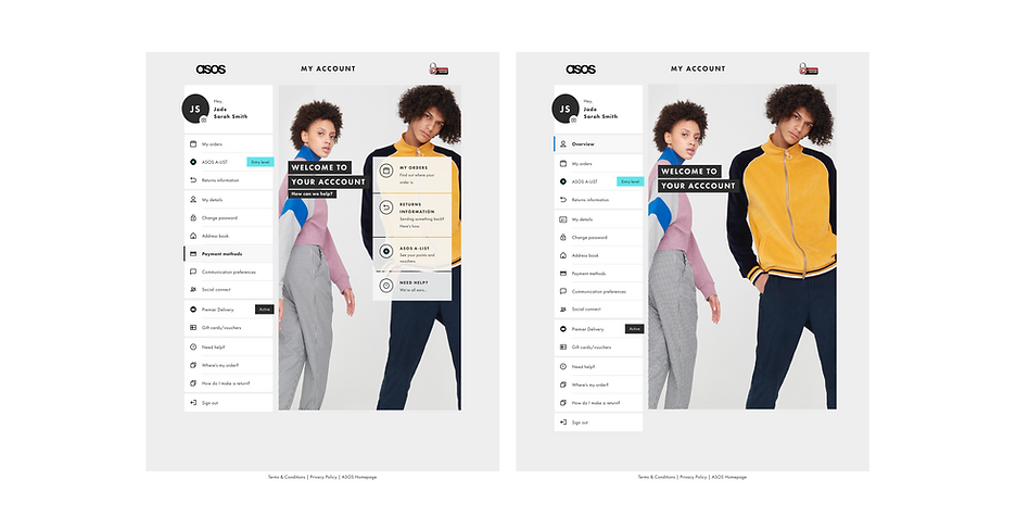
New Site Architecture
This was the final architecture of the site that we settled on, and as you can see really does incoporate a huge multitude of features from products to payment methods, loyalty and social media logins.

User Journeys
For each section, I would begin by drawing out the user journey for that section, marking out what scenarios there would be for the user and what their potential choices would take them. This was detailed as creating order and return statuses off the back of user surveys to find the best copy possible and what was possible with tech teams, to working with the next day subscription team and working out the best methods of notification of expiry based on their re-uptake analytics.


Wireframes
After defining and agreeing the journey with the various teams, the next step would be to create the underlying wireframes, define the interactions and give a sense of what the design will begin to look like. Formal or informally, designs would always be run past the developer to gain input and expand the designs and sense check feasability. At this point, even basic foreign language stress testing could begin to be made.
Wireframes for each section would be subjected to iterations of user testing, from low to higher fiedelity and remote or in person sessions.


Solving the problem
Overall, the teams and I were exceptionally happy with the final cross platform designs that were released. From the below you can see how we respected each platforms standards while still giving the same experience to the user. Periodic user-testing has continually found the My Account section to be simple and easy to use, as well as aesthetically beyond ASOS competitors, things that were always at the heart of the original design principles.
The below is a recording of the live site (Last updated April '23)

Cross platform & responsive
This was the first time that an ASOS project was attempted across all 3 platforms at the same time, as well as a fully responsive web experience. Additionally this was released on time and allowed us to end a costly 3rd party agreement that had been supporting the previous My Account version.


Accessiblility
From near the outset, the My Account redesign had the principles of AA WCAG accessibilty built into it. It affected the way that we thought about the design, the choice of colours for contrast and how to make best use of aria labels. We took accessibility sign off as stringently as a QA or UX/D sign off which was a fantastic learning opportunity for myself and the rest of the team.
The whole ASOS site was audited by several different accessibility consultants and during the build of the My Account section, we used the RNIB to gather and run accessibility testing on complete parts of the build. From all this, while we did not reach a 100% AA rating, it was relatively close.

Outcome
Users going from Order Details Page to Help Section (Web only):
-
Pre re-design: Desktop = 10.1%, mobile = 11.5%
-
Post re-design: Desktop = 9.1%, mobile = 10.6%