Creating a digital ID
Chase UK
Led a R&D project where we investigated the opportunity of taking ID documents that were captured during onboarding and finding a use for them for our users. Ended up creating a product that onboarded 33k users within 3 months, smashing our 10k user target and green lighting this from an R&D project to a fully fledged offering.
Platform: App
Role: Lead product designer
Date: 2022
For context
Being part of the initial team that launched Chase UK, our newly formed app only bank was coming up against the traditional banking incumbents and it was seen that value added benefits or features in the app would keep our customers coming back and eventually persuade them to make it their banking app of choice.
I was involved with the Research & Development team, where our goal was to find new and innovative additions to the Chase app, that our costumers would be interested and engaged in. We would quickly put something together based on user appeal, launch it, get evidence of genuine customer interest, and if so, this initial idea would be built out into its own, more sophisticated product.
We started thinking about customers ID documents
Chase UK, just like any bank, each and every customer must go through a Onboarding and Know Your Customer (OKYC) process where they would get customer personal data, with evidence (in the form of a picture of a passport, driving license or equivalent) and run checks on that customer. For due diligence, Chase must keep this data, so the idea came about, how could this data that we keep, be made useful for the customer?

So we ideated…
I ran workshops with the team with the focus of identifying potential user needs on and problems our customers could have in relation to using this type of sensitive information.

From this we created a vast raft of potential themes such as identifying ones self and protecting their identity online, and out of those, potential solutions to these themes, ranging from Digital IDs to password managers.
But now we needed to know if any of these proposed solutions actually were of interest to our customers and actually satisfied any of their needs.
So we took these to our customers…
With the research team, we undertook concept testing within a group interview, where we presented scenarios to the group and asked them about their initial impressions of each solution we had come up with it.
This was a real crucial step for us, as at this moment in time we had senior stakeholders and team members split in their opinion of what we should build and look to tackle. I was insistent that getting out of our internal echo chamber and getting real, honest user feedback would help us as a team to align on what our users actually needed.


Key findings
1. Keep my docs safe
The solution that appealed most was that of a secure storage of important documents such as passport, driver's licence, NHS number and more.
2. I need to access my docs
A number of user needs were identified (e.g. collecting of parcels, checking into hotels, booking holidays, purchasing age restricted items), with the biggest benefit was seen as easy access to all these important documents and additional benefit that users had a peace of mind that they were all in one secure place.
3. Chase UK is good option
Users agreed that financial institutions were seen as most the trustworthy organisation to keep and hold this type of information, even over big tech and the government. Compared to the Gov.UK concept of a digital ID, most user responded that they would prefer to use a Chase ID, over this government version.
So we decided to narrow our focus…
Our problem statement
When Chase users need to show ID to prove their identity either online or offline, they do not have a place they consider secure enough on their phone to hold this, meaning they do not have these docs to hand when they really them and the information contained within them.
Our solution
As a team we settled on creating a location in the app for users to store their digital IDs. They would have their documents that were captured in the initial OKYC process pre populated and be allowed to add more as they see fit.
Our competitors
Also at this time, Apple had announced it was bringing in the ability to store driving licenses to their wallet and working with the US government on this. The belief was if that if Apple were able to convince users to upload their documents to their device, as we already had them, maybe they would just utilise this features from our app.

I undertook desk research of existing digital ID apps to assertion what they did, and what were key features they offered and what potential problems they were solving.

Our expected user flows
And lastly I created user flows of the expected step by step user interactions when requiring to use the digital ID from the Chase app. These were offline and online scenarios that had been identified from the research as key use cases to consider.

Our success
What was success? Any feature in the app, customer would need to onboard onto (due to compliance & legal reasons), so were given a target of 10k customers onboarded as a sign of success, and this would then potentially move to the next stage where a broader product team would build out this in more detail.
So I began to design
My approach was to pull together wireframes and gather feedback from users fast and quickly iterate upon these to be able to quickly ladder up to high fidelity designs.
Design iteration #1
As I had already created some base designs from the concept testing, my focus was to flesh out the content first and secondly make sure that users could find our IDs in the app and navigate around content within the vault with easy.

Usability test #1
With a remote unmoderated research session, I tested a number of key hypothesis:


Learnings
Users had no issues finding IDs in the profile section or navigating around the vault.
Based on the results, there was no data to disprove hypothesis 1 & 3.
Users showed a clear preference for prototype 1
Usability results showed that users had no issues in firings the vault with the simpler "Your ID" list item from the profile section then the other options.
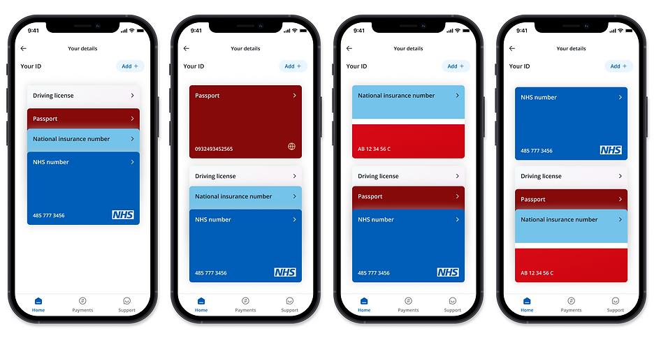
Design iteration #2
My attention turned to the list of cards view; obviously we were influenced by the wallet style UI and we wanted to add a more interactive approach then just a simple list here. So I started improving the card layouts and getting more variations in card types that we as a team supported.
Usability testing #2
With a second remote unmoderated research session, I tested a number of key hypothesis:
After undertaking this testing, there was no data to disprove either of these, with the vast majority of users easily being able to open up and flick through to the card they wanted, as well as being able to directly jump into the card details if required.
-
"It was clear that I should just press the arrow button on the license to get more information."
-
"Easy to find and easy to understand"
Design iteration #3
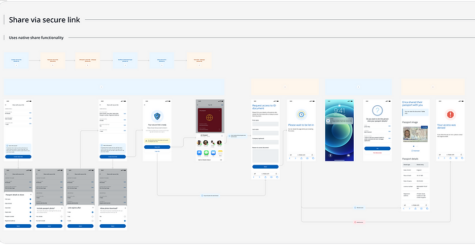
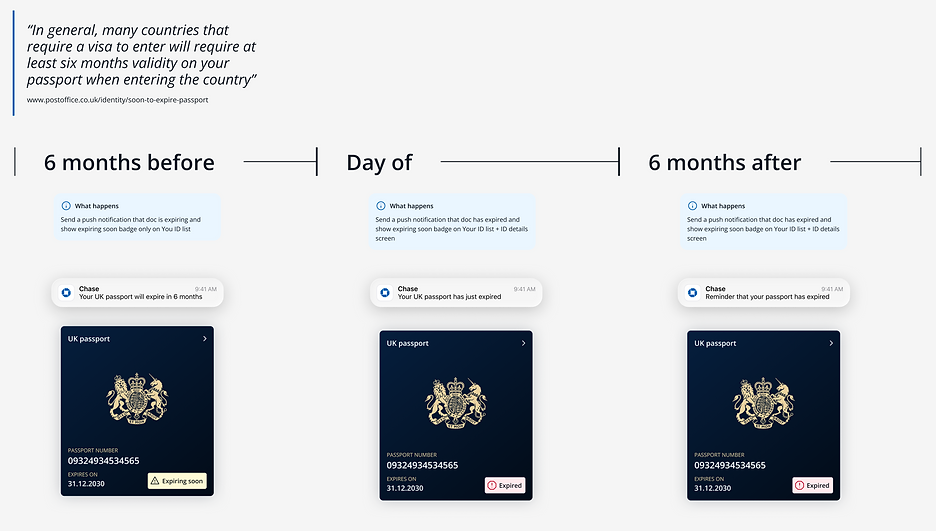
At this point, we had the base features design, tested and iterated and a good sense of how this how section worked. From that though we did two main things, we focused on improving the UI and interactions of the cards themselves as well as looking at more detailed features such as sharing your information, being notified of expiring IDs and others.

Usability testing #3
With the last remote unmoderated research session, I took the opportunity to focus on the sharing and download feature that we had created.
For hypothesis 2, no data was found to disprove this and users could easily share their IDs in the methods that we provided.
For hypothesis 1, what we saw was that by adding the overflow on the cards, users instantly were faced with a decision, "Do I press the chevron or the overflow in order to see card details" and around 30% would go into the overflow options, see they could enlarge the ID and read the details off the image, instead of seeing them in a much easier table view via the chevron.
By seeing users do this, I removed the overflow to make it a simpler and more obvious experience; a single click to take them into the details, and then another click to then see the next set of options.
Final designs
I worked closely with a UI designer and our motion designer to work out how we could improve the animations and interactivity of the IDs upon entering the screen and interacting with them, and then the layouts of the card information aswell.

Detail view
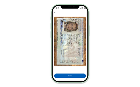
For each document we would share the visual of it that the user had uploaded and if the was a back to it that was required to upload, that could be seen by simply swiping.
Each piece of data was taken out and displayed in a table view underneath where the user could also copy it and do what they needed with that.
A additional label to say "Verified" would help users when showing this to inform that this ID was indeed vetted by us at Chase.

Enlarged view
From the detail view there was an opportunity to see an enlarged view where if the user wanted to show anyone in detail their ID, they could simply show them via their device.

With the range of different ID cards that a user could onboard with we created a set of assets to support these, as well as aligned and standardised the location of the key ID information as well as the expiry


Outcome
With a single marketing email promoting this new feature and relying on user naturally finding this feature...
33k
Onboarded users in 3 months
400
Daily unique users of Digital ID section
20%
Users interact with the fullscreen mode
With this amount of users onboarding onto the Digital ID, the goal was hit of showing sufficient user engagement and interest in this product, and this moved from an R&D project and is now a dedicated product within Chase to be evolved and iterated on.