Changing strategy for paid media landing pages
Led the design of a new paid media landing page, based on the new strategic direction of focusing on nurturing & capturing leads to then subsequently boost acquisition . Leveraging user research on our designs and concepts and smartly using existing tools, this led to an increase in captured leads of 1.5%, increase of acquisition by 9.2% and overall revenue increase of 6.6%.
Platform: Web
Role: Lead UX designer
Date: 2023
For context
I was the first UX designer brought in to work with the Google Ads SMB Marketing team in EMEA, helping the teams main goal of customer acquisition. The role spanned projects working with Google partners to improve Google Ads acquisition on their platforms, setting up research and iterating on GoogleAds.com, to aiding my direct team on their paid media strategies.
Our problem
So a PM came to me with this and asked me to help:
Some* high-value SMBs have long consideration journeys, and need more convincing** than our current value proposition*** provides.
Evidence* 42% of SMBs have several touchpoints (approx. 2 - 8) before converting
Evidence ** SMBs require more education and reassurance:
-
45% want to feel confident about using Ads products
-
35% need to convince skeptical decision makers
-
44% need social proof and success stories
Evidence *** Conversion-based messaging, featuring high-value incentives "Spend 400, get £400"".
This was interesting to us as a team as we were currently implementing a demand capture strategy across our entire paid media experience in EMEA, from the ads prospects saw to the landing pages linked to them, where we were wanting them to sign up then and there.
To prospects who are still in a consideration stage and simply not ready to sign up, our current messaging and landing pages were simply not tackling their needs.
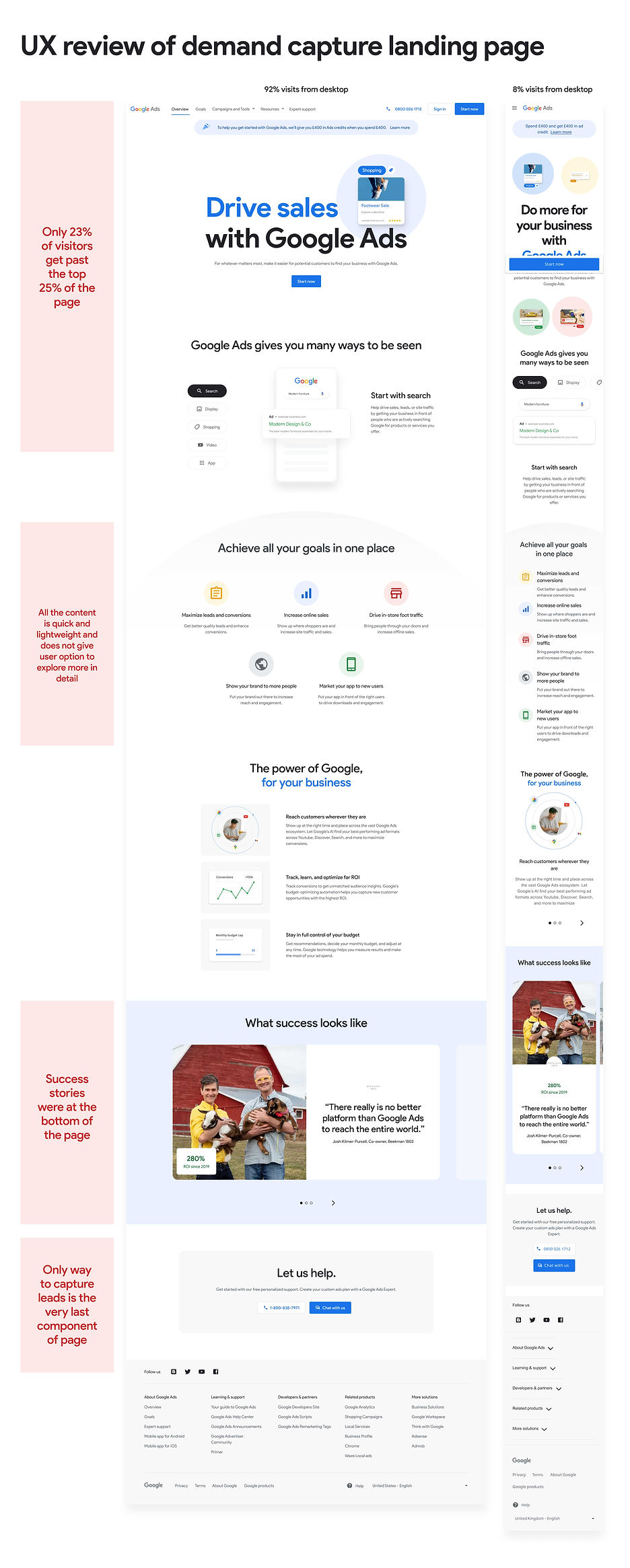
Our landing page
I took the opportunity to do a quick review of the current page with this context in mind.
Our hypothesis
We crafted the hypothesis that if we reach these prospects with more relevant & tailored content which is more focused on their needs & barriers at a different stage in their journey (specifically mid funnel), then it will keep them interacting with the content for longer, helping to educate them as to how this can be useful for them and overall convince them to sign up to Google Ads.
So how might we do this?
I brought together the team and ran an idea generation workshop with the aim to review existing elements and tools and determine if we could re-purpose these to help us capture leads, as well as coming up with any new ideas. There was a desire to focus on what could be repurposed as this simply meant we could move faster.

The most obvious place to address was the core content of the page.
We wanted to push an educational ark to our content, especially if user were returning multiple times and layer in content that was relevant to them to help them understand how Google Ads could help.
Also our content designers set about creating guidelines (Shift to value messaging) on how we communicate and discuss these topics, so I awaited their feedback to help layer into the page.
From this we came up with adding a new tool to our landing page, Smart Calculator
The direct sales team currently had a tool (Smart Calculator) where they would fill out some basic information on the users behalf, and then that prospect would receive a set of PDFs containing links to a recommended media plan and a strategic guide on how to the most out of Ads. From this the sales team would reach out at regular intervals to the prospect to try and convert them.
The idea was to utilise the existing assets they had, uplift where possible and introduce this into our lead nature strategy as an additional way to capture leads.

I set about updating these PDFs to align them with the new components and branding that had been created, as well as crafting the sign up journey from our landing page to the email coms where the user would find these PDFs.

I introduced a banner into our landing page, that would launch a modal where the prospect would enter key business information.

The prospect would then receive 2 emails, the first as a confirmation of sign up and then the second 24 hours later with the media plan and guide.

I updated the media plan and guide based on the new branding and additions of the social proofing features that we knew our users wanted to see.
In addition, we wanted to drive more users to the connect with the Direct sales team
Currently, our landing pages did have a mechanism to connect with the Direct Sales team however we wanted to make this clearer to users and drive more traffic to this channel to capture further leads.

I undertook desk research of existing digital ID apps to assertion what they did, and what were key features they offered and what potential problems they were solving.
So we took this to our users
Qualitative feedback of current GoogleAds.com
We had just rolled out a major rebrand of the main marketing website and updated our key messaging so we had already put in place a UXR study to get qualitative feedback on this. This feedback would be beneficial as our current landing page used very similar page components and used the demand capture strategy that we were looking to iterate on.

UXR learnings
Desire for a single, connected storyline
At the minute the page feels more like individual disjointed elements.
-
Goals section, like to see which ad types would better support each goal.
-
Value prop section, they'd want to better understand how Google could help them achieve their goals.
-
Success Stories section they wished for some sort of wrap up, with case studies featuring ad types, goals and results.
Desire for personalised and relatable content
Users want to see this so they can have all the info before making a strategic decision. When users connect to these examples or stories, they can in turn see that Google Ads is applicable to their own business and goals.
Make it more direct
Many felt that the existing landing page is more direct and straight to the point, which they preferred.For example, the content of the Goals Module was not particularly useful or engaging, while taking up a lot of space.
Concept testing of Smart Cal
I quickly pieced together an initial version of the new lead capture landing page and introduced a method to get to the Smart Calculator. Myself and the UX researcher decided to spend our users time focusing on the this new concept as opposed to the landing page, especially we would get feedback on a similar page from the other running UXR.

For our testing we hand a range of goals from findability of the banner, understanding of the value prop, to ease of navigating through the email and PDF content to whether this met prospects needs & expectations.
UXR learnings
Users overall did not have any usability issues with any of the touchpoints
...however, a few participants claimed the module is hard to notice while scrolling through the page as there are other contents competing for their attention.
Overall disappointment with the degree of personalisation in their media plans.
The level of personalisation expected in users' media plans is closely tied to the amount of information they were asked in the Smart Calc form and the 24 hours wait.
The wish for more personalised interactions.
That expectation is set upfront by the photography that accompanies the media plan module and also the DSA module across different emails.
As participants often look for guidance, they expect a human being getting in touch with them to better discuss their media plan.
Participants often mentioned that the media guide is actually more informative than the media plan
Also, they would spend more time reading this one as this better answers some of their key questions on HOW to do things.
Iterating to get to final designs
Updates to the landing page
Based on user feedback, senior stakeholder input and iterations from the initial thinking, below is the final design of the paid media landing page.


Hero
messaging
-
Key message is the tagline from the overarching Lead Nurture Strategy
-
Overall message & imagery is symmetrical to the messaging in the initial Ads and that aligns to the campaign.
-
"Align value prop & marketing messages across all channels" (Feedback research).
-
-
Add Direct Sales team CTA to increase lead captures


Relatable social proof
-
Use social proof to focus on the barrier of perceived cost/ROl and the need of reassurance. ( Shift To Value Message guidelines)
-
"Users want to learn more about the businesses and how they achieve their goals"
-
"Users want to see case studies they can easily relate to".
-
-
Use Lead Nurture messaging tactic: the voice of real business with real results.
-
"Participants often felt that they didn't have enough information about the businesses, and more metrics would be helpful."
-
-
Maximise horizontal space and get 3 stories instead of just 1. Preference to use all small images to maximise vertical space. This also sits within the top 25% of the page.
Smart calc capture
-
This tool is specifically built for lead nurturing in mind, so is added as high up the page.
-
Component is larger and more noticeable than previous version of banner
-
"A few participants claimed the module is hard to notice while scrolling through the page as there are other contents competing for their attention."
-
-
Component gives more explanation of why you should sign up and what you will get out of it than previous banner.


Focus on key goals
-
Reduce down to top 3 goals, focusing on barrier of product relevance, & make it clear that GAds is relevant to their objectives. ( Shift To Value Message guidelines)
-
"Goals module seen as vague and ineffective... participants didn't feel that this section communicated anything new or intriguing to them"
-
-
Boosted the copy here from the separate goals page to delve deeper into each goal and explain more.
-
"User start planning be setting their goals, Meta & LinkedIn mimic this, but GAds doesn't.... consider goals more prominence."
-
Ease of starting
Educate on the simplicity of starting by focusing on needs that users must have Functional Education, and need to feel confident about running and using the range of products and features offered.
( Shift To Value Message guidelines)

Iterations of Smart Calculator
Due to time constraints we launched Smart Calculator as it was, with the only update being the banner in to it. However what we did do was plan for Smart Calculator V2.0.
Based on ideation workshops I ran and stockholder input, I created a second phase which instead of a PDF was a dedicated webpage that looked to address the key pain points and needs that V1.0 was lacking.
Outcome
The new landing page was put live and our data analysts compared this to a control and presented back findings.
9.2%
Increase in acquisition
Primary metric
1.5%
Increase in lead captures
Primary metric
0.3%
Increase in quality visit rate
Primary metric
6.6%
Increase in overall revenue
Additional metric
17.4%
Increase in ARPA
Additional metric
All of our key KPIs were up against the control but actually one of the most interesting results was around revenue and ARPA increases. Not only were we getting more prospects to convert but these prospects were actually spending more money on ads, which showed the content that we were promoting was extremely effective.